
Whatever today takes, Vesi gives back.
Vesi is a new hydration drink for young athletes. Created by a mother of three who spent years reading labels and looking for something better than what was available on grocery shelves, she decided to craft something new.
The Vesi leadership team engaged with us for strategy, messaging, product/market fit, brand, and packaging design.
The Challenge
Young athletes typically drink a sports drink that is largely sugar water, or they take a vitamin once a day, and then they are done. Their parents are often looking at the labels of these products, and trying to choose between the two.
The brand had to be clean enough for a parent to read the label once and trust what’s in it, while also being cool enough for a teenager to want to drink on their own. The brand also had to make the case for the product’s added benefits of gut and immune support for hydration, in a clear and believable way.
Our Approach
We started by mapping out the athlete’s world. It’s not just about the game. On any given day, an athlete is a student, a teammate, and a friend. All this leads into gamete.
That became the idea behind the brand we built for this hydration drink: whatever today takes, Vesi gives back. Support for the whole day, not just the game.
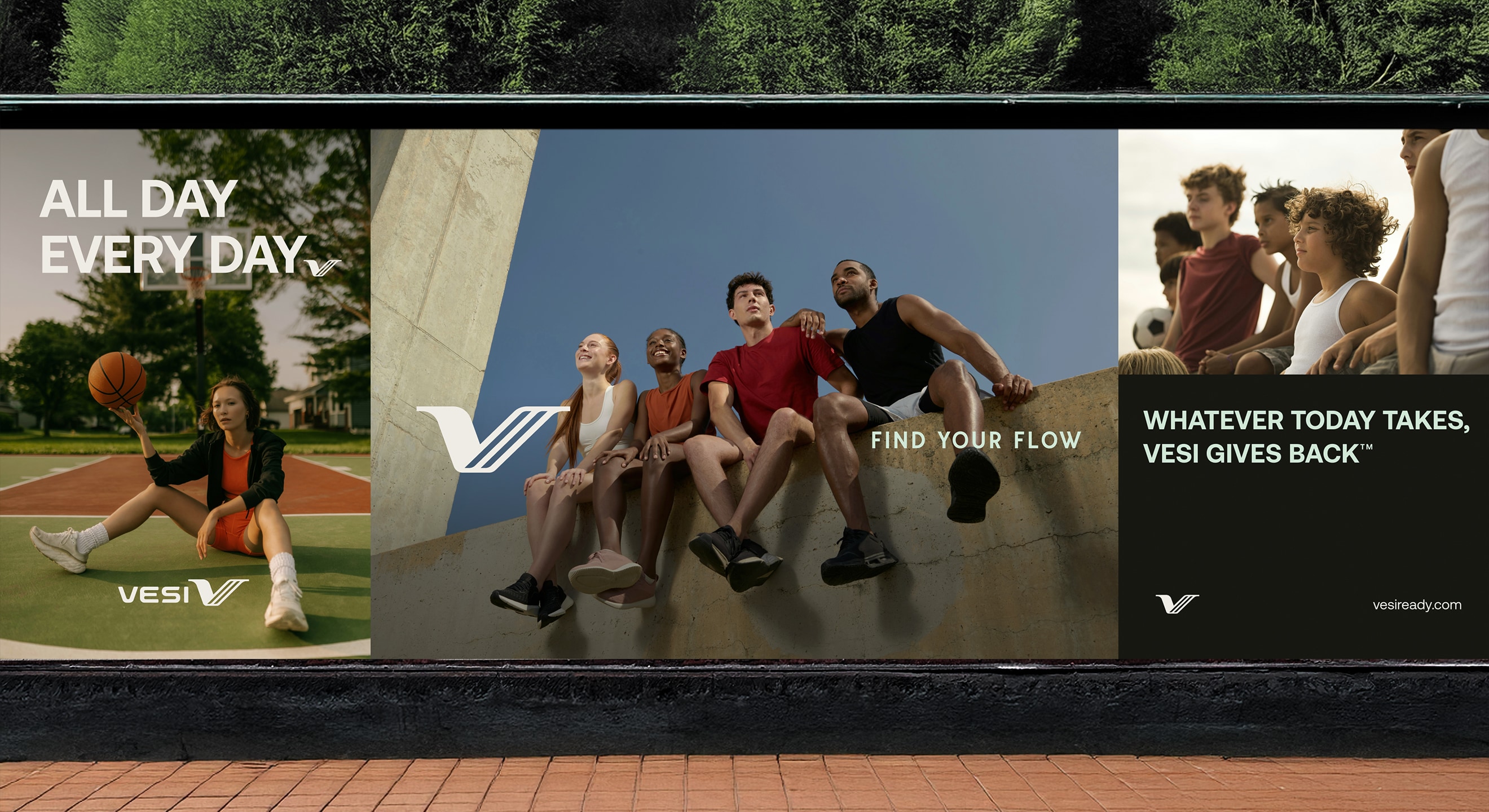
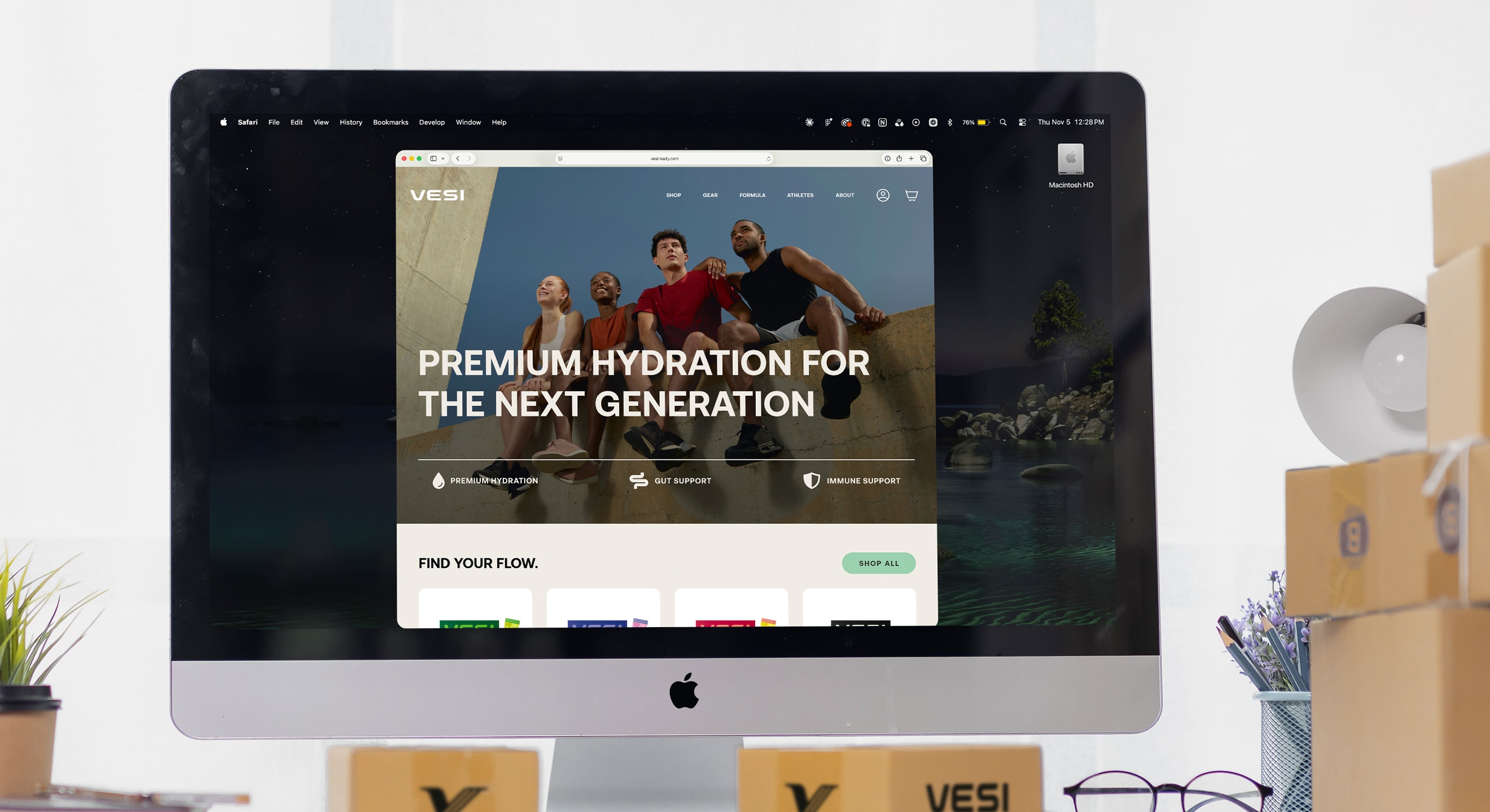
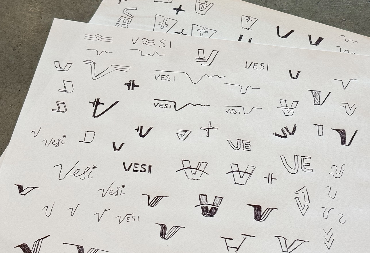
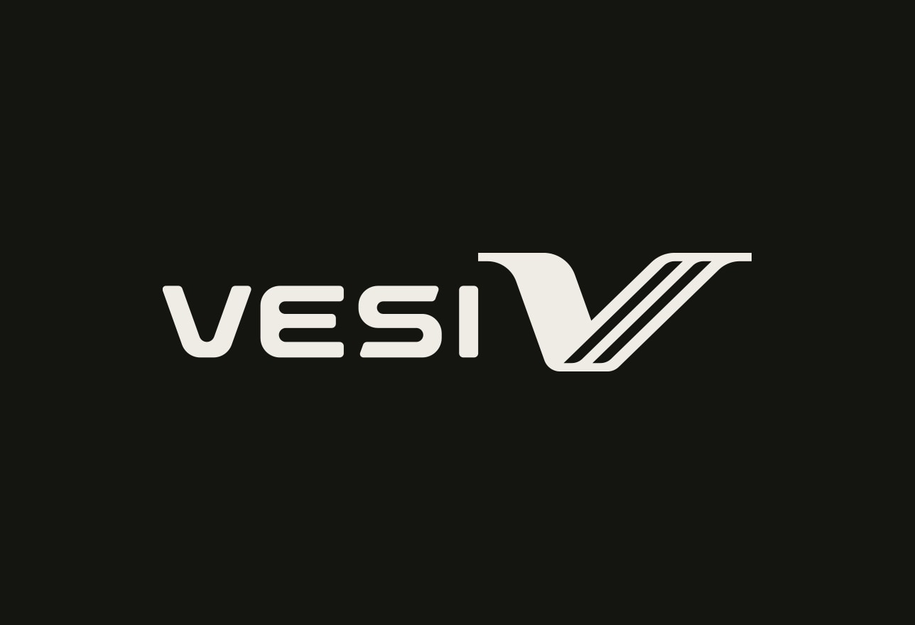
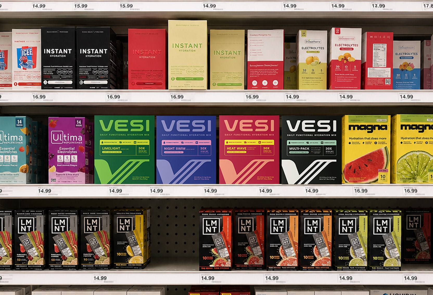
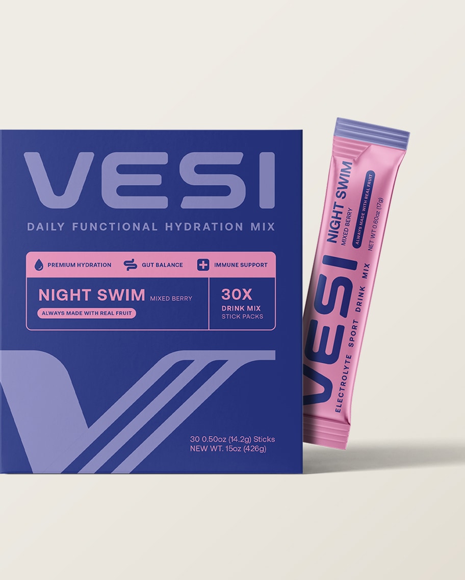
We built the brand around these main areas:
- Strategy & Product/Market Fit: Defined the target audience and established the brand’s unique positioning of hydration, gut and immune support in a single daily stick.
- Messaging: Developed the big idea, five themes, and voice for the brand. Kept language in food territory (as opposed to supplement territory) and maintained a confident but low-key tone.
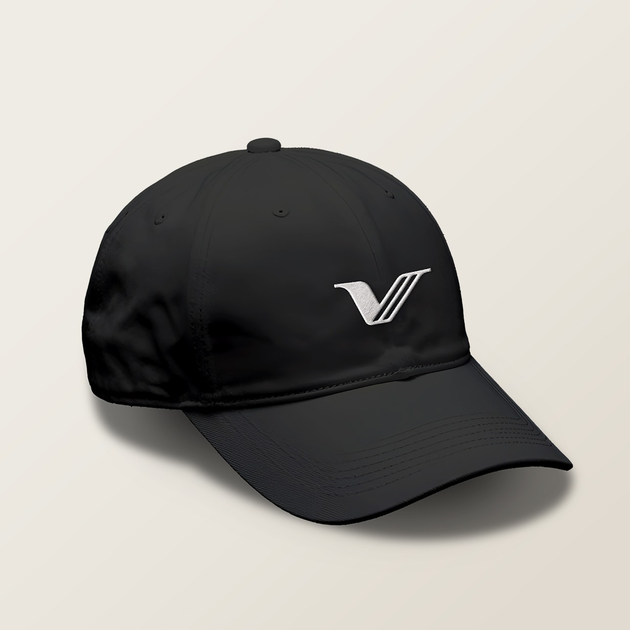
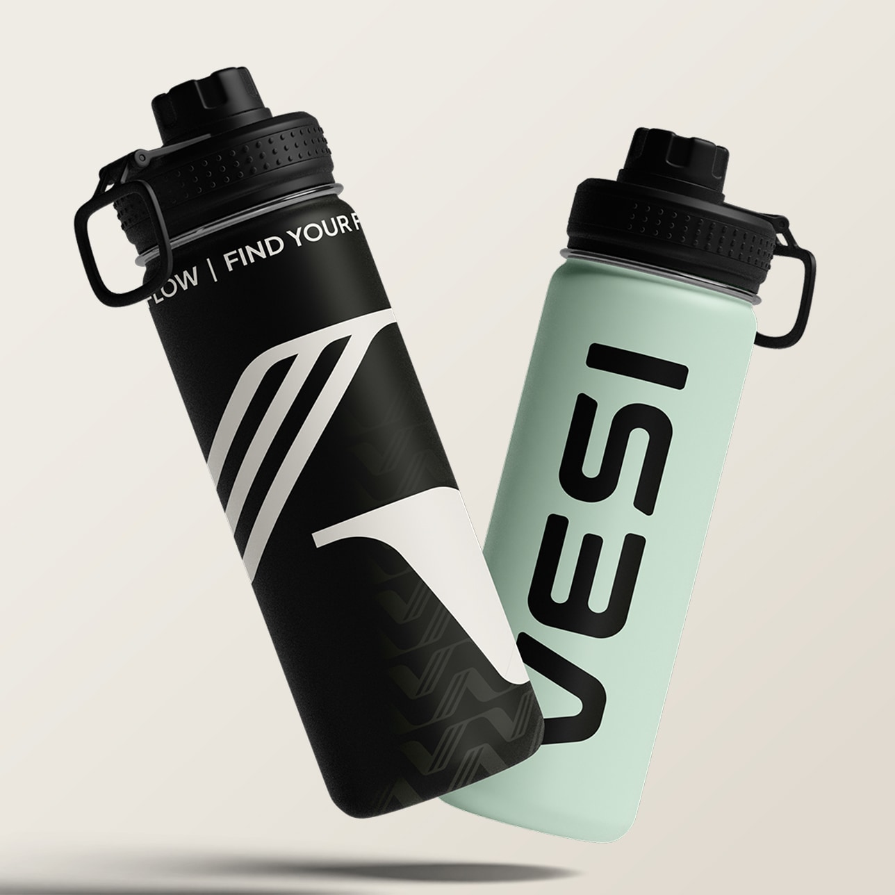
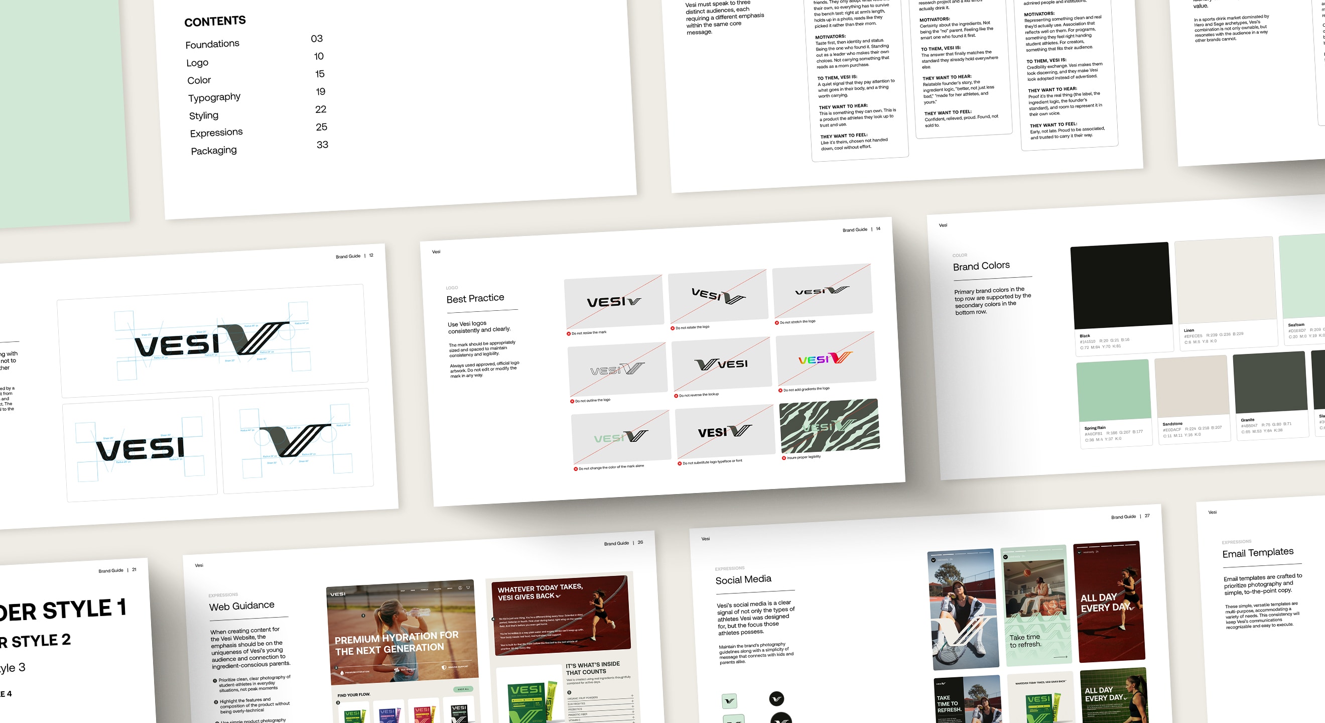
- Visual Identity: Logo system, limited color palette (black, linen, seafoam), repeated mark pattern, and photos of everyday athlete moments (no podium shots).
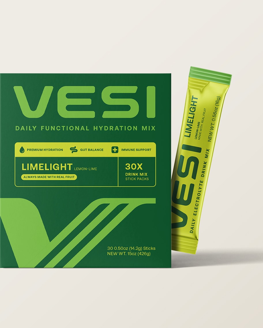
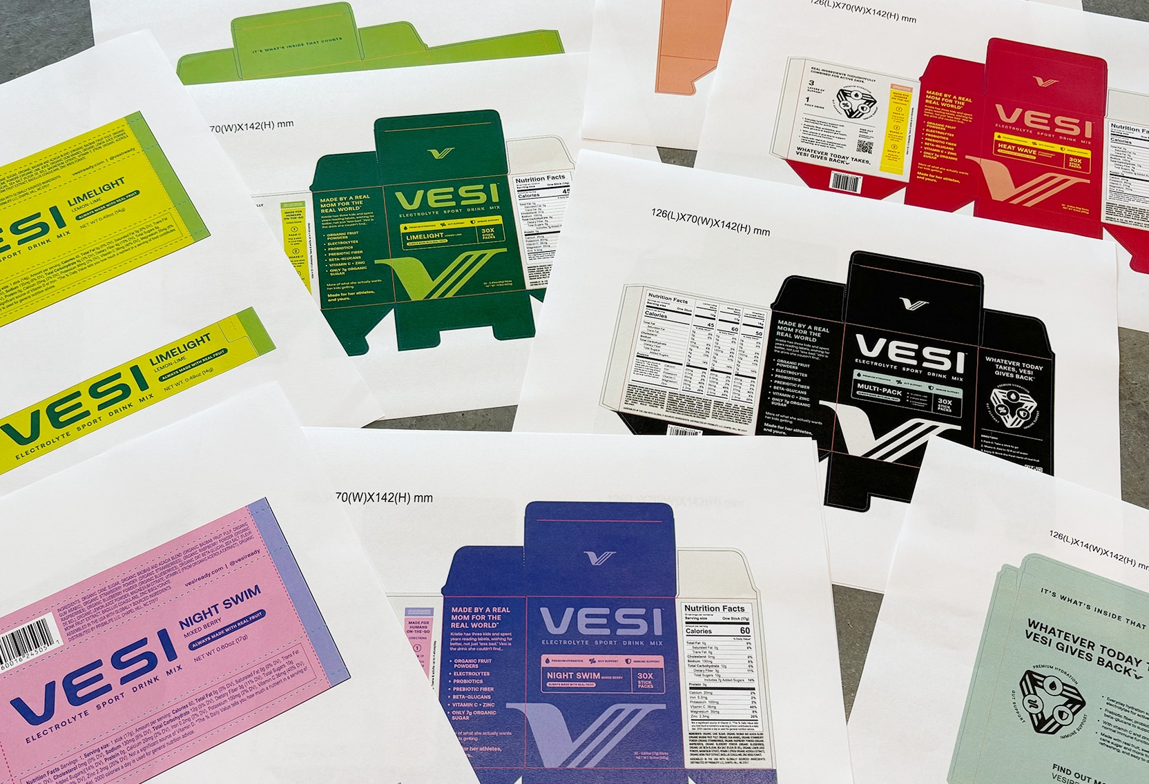
- Packaging Design: Carton and stick pack design for all flavors. Each flavor has its own bold color palette. Front of package is clean and back of package is warm for parents.
- Brand Guidelines: One guide for the team and partners across web, social, email, merch, and packaging.
The Outcome
Vesi now has a brand that speaks to the athlete and the athlete’s parent, and a package that looks like something the athlete would have chosen for themselves.


Interested in working with us?
Book a free 15-minute consultation call.